 eyckgalleryartistsexhibitionsnewspublications
How to Look Out
By Xander Karskens
When I visited Marijn van Kreij’s exhibition The Passenger at Galerie Paul Andriesse in Amsterdam in the spring of 2011, my attention was caught by a recent, largescale drawing: Untitled (Bruegel) – an impenetrable, monochromatic maze of pencil lines from which familiar forms akin to trees and human figures gradually materialise. I recognised this type of drawings by Van Kreij: shortly after his graduation in 2003, we had worked together on an exhibition in Playstation, the project space at Galerie Fons Welters, which centred around these monumental, labyrinthine pencil works. The complex, densely-packed compositions resulted from projecting the contours of architectural photos culled from books and the internet onto an enormous sheet of drawing paper, and tracing them in pencil. Image upon image, layer upon layer, until the architectural forms are reduced to a fine intermeshing of lines – the compositions ultimately constitute a futuristic, hybrid kind of chaos architecture. Although the artist’s intentions lay elsewhere for the most part, this work resonated with ideas about globalisation, virtual networks and mapping, which inspired many artists at the turn of the century. For me, they brought to mind the work of Julie Mehretu and Corinne Wasmuht, artists who delineated ‘space’ in very distinct ways, but the visual language deployed by Van Kreij was more graphic, less painterly, and his artistic project more fundamental. These works only indirectly engaged with such themes as mapping out the world, primarily concentrating on essential artistic questions like: when is a drawing ‘finished’? When does representation dissolve into abstraction? When is an image still legible?
As I had not seen drawings of this sort since Van Kreij’s residency at the Rijksakademie in 2006 and I thought he had become tired of the manneristic approach that they depend upon, Untitled (Bruegel) took me by surprise. It is a hallucinatory work, complicated and finely balanced, brimming with visual intelligence and a delight in drawing. What’s more, I realised, it is a work in which all aspects of Van Kreij’s artistic project converge: his drawing background, the tension between the mechanical and manual reproduction of existing visual material, and his attempts to allow spontaneity and chance to figure within his conceptual frameworks.
Appropriation
Like that of many artists of his generation, Van Kreij’s project can best be grasped from the perspective of its complex relationship with the modernist legacy of the twentieth century. The interest in this legacy makes sense: it is the interest of a post-ideological generation that understands that early twentieth century universalist theories no longer offer any foundation, but from which they hope elements can perhaps be extracted that, in isolation, can inform a critical reflection of our contemporary culture. The burgeoning laissez-faire attitude of the interminable appropriation and reproduction strategies that have manoeuvred art into an Ewige Wiederkehr des Gleichen since the 1980s nonetheless renders these strategies problematic. Referring to and re-using existing, successful aesthetic vocabularies from eras past (and specifically the ideologically-charged modernist language of form) rapidly deteriorates into a vacuous style of fetishism. It is extraordinarily exacting, if not impossible, to isolate cultural production from its original context and relocate it in time – let alone to assume that all the artistically fruitful aspects of this original sociocultural context will automatically illuminate the meaning of the new artwork. Luxuriating in the comfortable warmth of accepted and valued cultural signifiers under the pretext of ‘critical reflection’ is simply unsatisfactory. This is one of the challenging questions that artists like Van Kreij, for whom appropriation and the renaming of existing images are key strategies, have to face.
Envelopes
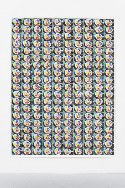
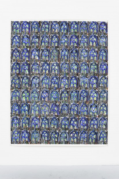
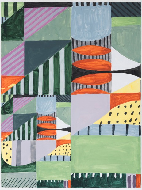
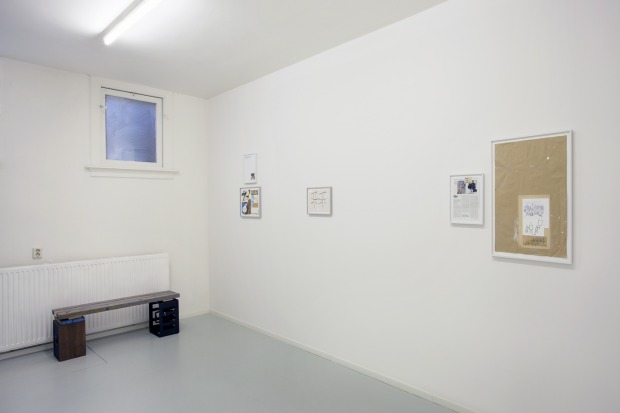
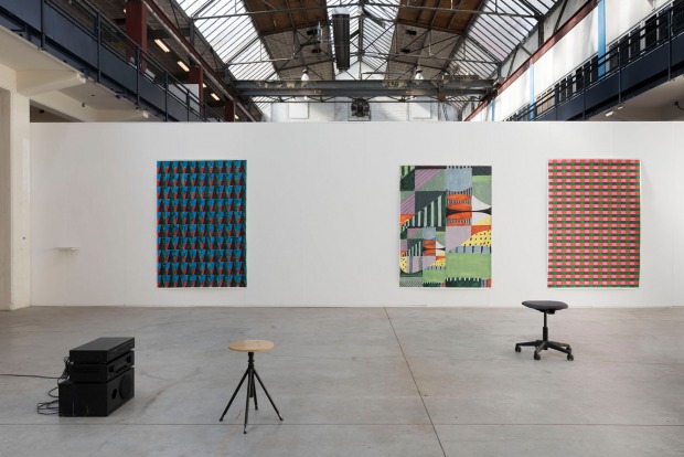
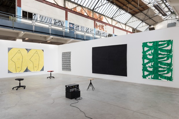
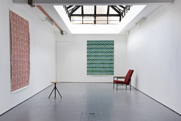
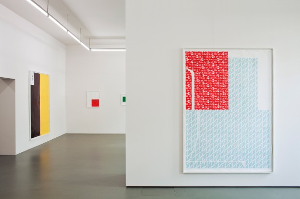
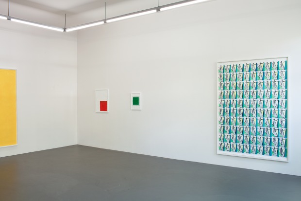
Several years ago, Van Kreij embarked upon a series of monochrome abstract works in different formats that restore the abstract-modernist grid to its former glory. At least, so it would first appear: they are rectangular drawings or paintings on paper of a repetitive geometric pattern – sometimes set on a horizontalvertical axis, sometimes on a diagonal. The grids have an industrial quality as if their sometimes complicated modular shapes are produced by the algorithms of a computer. But in none of these works is there a striving for absolute, geometrical perfection: incidental errors are detectable in the fabric of the grid, betraying the hand of the maker and deposing the impersonal objectivity of the (non-)image. In this series, Van Kreij conflates the archetypical abstract-modernist visual motif of the twentieth century with a mundane object from his everyday life: the grids are copies of the graphic patterns found on the insides of envelopes. Like the chequered patterns Daan van Golden painted in the 1960s while in Japan, inspired by handkerchief and tea towel designs, these ‘abstractions’ are also appropriations of existing images and as such are actually not abstractions but representations of reality. This ambiguous status of the image, where the relationship between source and representation is unclear, is illustrative of the artist’s attitude to the images that surround him.
Repetition and Difference
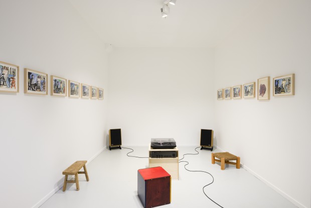
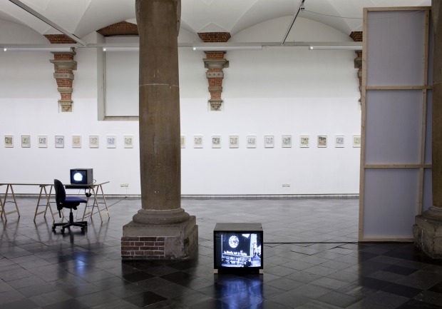
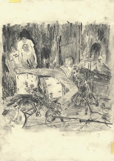
Untitled (Nirvana) (2006-) is a series of A4 pencil drawings Van Kreij began in 2006, to which he adds intermittently – at the time of writing, Untitled (Nirvana) consists of over 40 drawings. Each drawing is a rapidly sketched but realistic copy of a photo of a live performance by the band Nirvana. The photograph was taken at the end of a set, when singer/guitarist Kurt Cobain leapt backwards into the drum kit – a cynical interpretation of the ultimate rock star cliché, immortalised in the inside sleeve of Nirvana’s debut album Bleach released in 1989. Van Kreij’s
serial duplicative action is characterised by repetition and difference: repetition focuses attention on the differences that occur – those between the original and the duplicate, and between the copies themselves. Each drawing is made using an ordinary graphite pencil on a white sheet of paper, but the variances in nuance are substantial: sometimes the white surface is more yellow-toned and the pencil sometimes a lighter gray, and sometimes black. A number of drawings in the series (despite the speed with which the drawing was typically executed) are precisely detailed, and as such offer a convincing photographic reproduction; most are looser, sketchier, with a more suggestive approximation of realism, and are stained with coffee-mug rings and other non-original visual elements. The object of the Untitled (Nirvana) series is not to systematically improve draughtsmanship skills to arrive at an ever-more convincing copy of the original photograph. In the first instance, the series discloses the human impulse to return to a familiar motif, the compulsive inclination to sink into the blissful comfort of an evermore refined psycho-motoric automatism. In Untitled (Nirvana), however, Van Kreij is forever searching for the point at which the automatism begins to falter and anomalies sneak in (a head slightly lower, a drumstick in a different position), prompting a continuous evaluation of automatism. The reality between form and meaning becomes gradually more diffuse with every new addition to the series: each new facsimile tugs the scene a little bit further away from its image source.
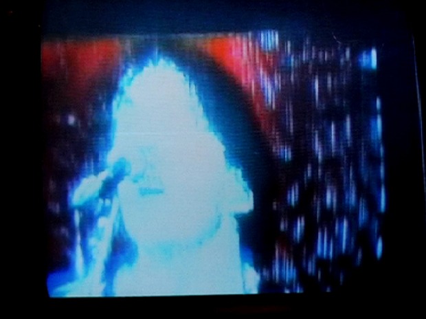
This conceptual strategy and the play with repetition and difference also informs Hey Hey, My My (Into the Black), a series of video works (begun in 2008) based on a 1979 recording of Neil Young performing the song by the same name. For every new presentation of the work, Van Kreij films the video from the monitor by placing the camera in front of it. The gradual audio-visual degeneration that occurs has a notably temporal aspect in this work: as it unravels in time, the original video footage progressively dissolves into its own feedback.
Untitled (Nirvana) and Hey Hey, My My (Into the Black) exemplify how Van Kreij employs notions of seriality and reiteration to initiate a meaningful relationship with his ‘found’ images. In modern art history, repetition and seriality have primarily served as a strategy to constrain the relationship between signifier and signified – to destabilise the conventional meaning of images and objects by emphasizing their representation. Furthermore, for the minimalist artists of the 1960s, for instance, this approach was a way of revealing the impersonal, objective character of the uniformity generated by mass production. In his work, Van Kreij is apparently searching for a more dialectic relationship between this objectifying, critical position and a more affective relationship with images, more tender if you will – a coalescence of rational-analytical and intuitive considerations of the image. His exercises in duplication question the tenability of the aura of images while also being active attempts to resituate the reproduced image in the domain of the personal, to charge them with a sincere emotional investment (and the signature) of the re-user.
Double Drawings
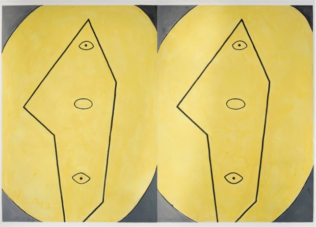
In his double drawings, Van Kreij has discovered an entirely unique way of further exploring the relationship between original and copy, and rational and intuitive processes. Works such as Untitled (When You Read, You’ll Judge) #1, #2 (2006) or Untitled (Like A Skipping Record) #1, #2 (2010) comprise two almostidentical colour drawings on A4 sheets of paper that are presented side by side. One – executed in different coloured pencils, felt-tip pens and types of paint – seems a relatively precise copy of the other. The drawings call to mind random doodles you might produce while concentrating on something else: the apparently random collections of amorphous scribblings and scratches are clustered with textual fragments (often – as is the case with many of his titles – taken from song lyrics, film dialogues or artist statements) and coffee and other kinds of stains. The conceptual crux of these works is hidden in their creation process: rather than completing one drawing and copying it faithfully, van Kreij works on both drawings at the same time, letting spontaneous shapes emerge in the first drawing, which he then reproduces in the facsimile. This approach allows van Kreij to connect the spontaneous creative gesture (the stream of consciousness-like musings) with the calculated action of his duplication, instigating a concentrated moment of artificiality. Because, to what extent does the first ‘spontaneous’ or ‘intuitive’ expressive gesture really justify that description when the entire process is plotted out beforehand? In a more general sense, this dialectic is the foundation of the artist’s practice. How does a strict conceptual framework relate to the spontaneous creative impulse? Can the artist reconcile rational logic within the artwork with intuition and coincidence? And what is ultimately the status of the ‘original’ and the ‘copy’? In the double drawings, Van Kreij has hit upon a way of visualising these fundamental polarities and simultaneously symbolising the pointlessness of this undertaking. It is as though Van Kreij deployed the banality of these besmirched drawings with their stains, scratches and snatches of text to both magnify the complexity of these issues, and put them in perspective.
How to Look Out
The oeuvre of Van Kreij is typically a product of our time, in which the distinctions between high and low culture have become hazy, the dissemination of images is instant and almost infinite, and categories such as ‘copy’ and ‘original’ have become outworn. The meticulousness with which this artist continually attempts to relate to sources of a very disparate nature, from an existing autonomous artwork to evanescent internet pulp, is indicative of the flattening-out of the hierarchy within today’s visual economy. How to Look Out (the title of this publication and the exhibition in De Hallen Haarlem) is a plea for care and awareness. The title is taken from the satirical, comic-book style manual about looking at art produced in the 1940s by Ad Reinhardt for an American magazine. The choice of How to Look Out speaks volumes: Van Kreij uses it in the ambiguous way so characteristic of his work. Because whether he wants to lead us by the hand and teach us ‘how to look out’, or chose this statement to – with a sigh – express his own artistic doubt, remains to be seen. We can only try and embrace his attempt.
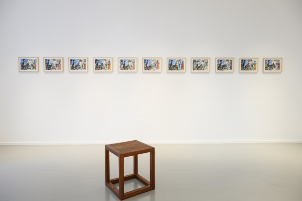
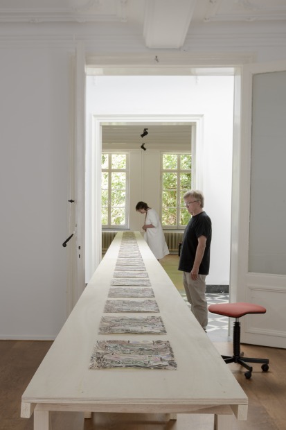
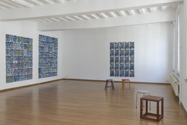
Gouache and pencil on paper
11 drawings, 21 x 29.7 cm each
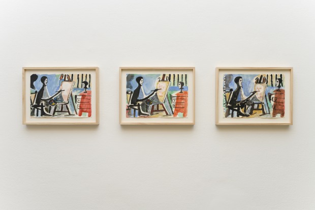
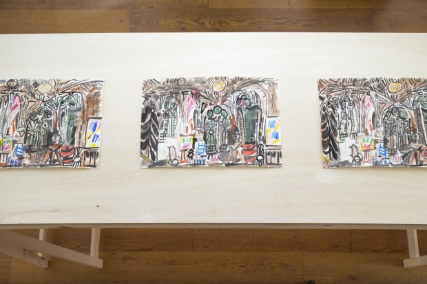
Gouache and pencil on paper
3 drawings, 21 x 29.7 cm each
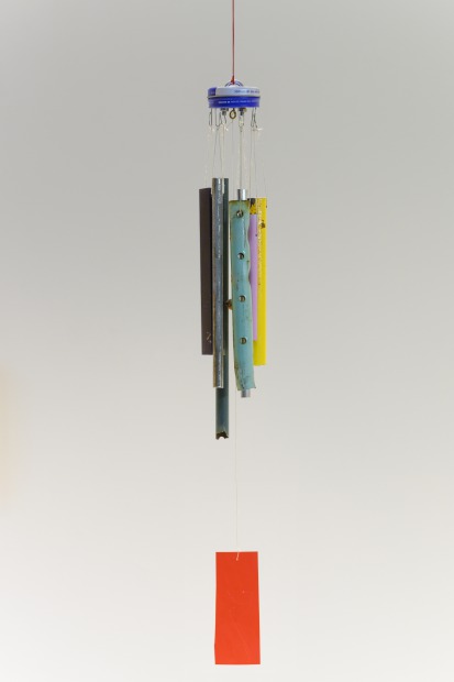
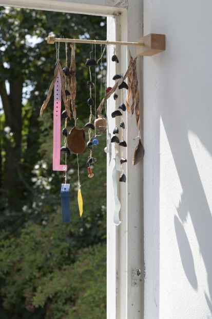
Wood, metal, thread and plastic, dimensions variable
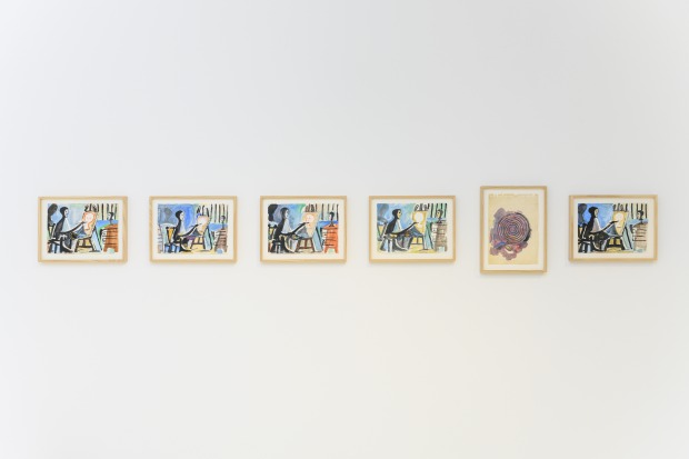
Gouache and pencil on paper
5 drawings, 21 x 29.7 cm each
Marijn van Kreij, Untitled (Worlds of Possibility), 2003, 2018
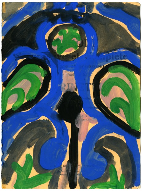
Gouache and pencil on paper
29.7 x 21 cm
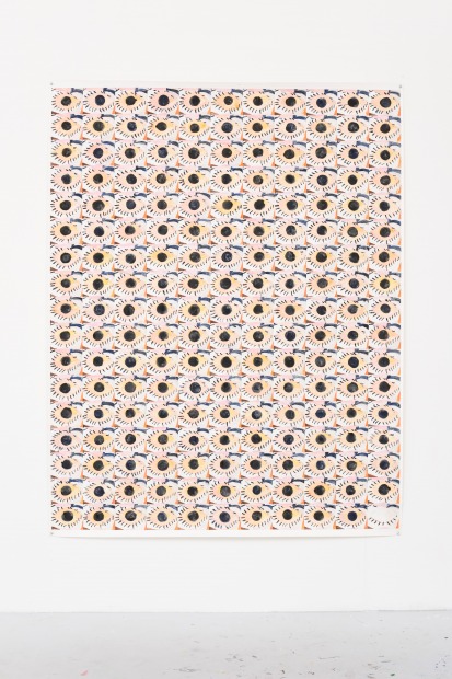
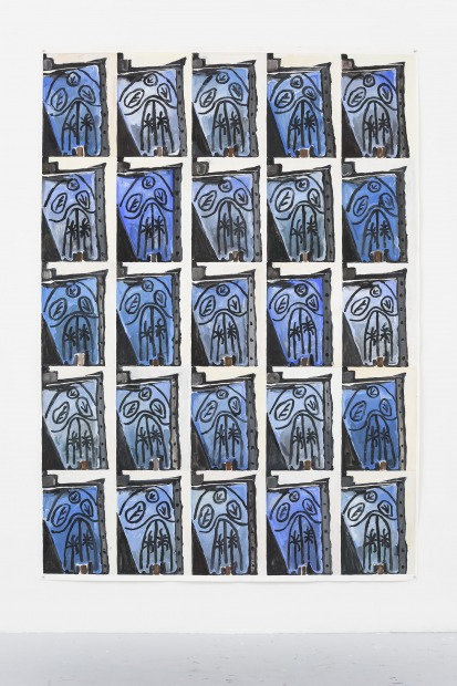
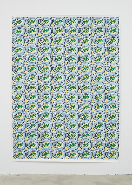
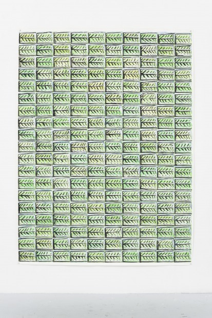
 2015 gouache and pencil on paper 102.5 x 77 inch.jpg)
, 2015 gouache and pencil on paper, 96 x 75.5 inch.jpg)
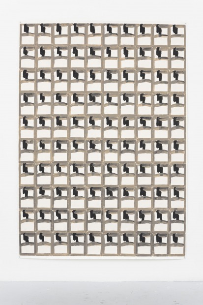
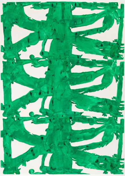
1956), 2014, Gouache and pencil on paper, 215 x 152 cm
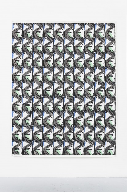
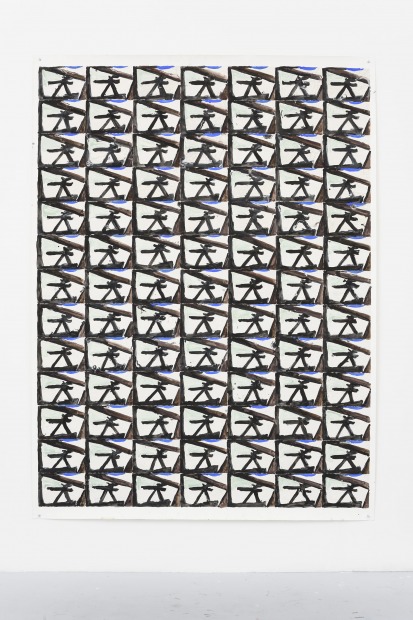
2013, Gouache and pencil on paper, 206 x 152,5 cm
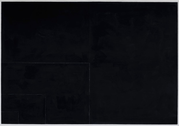
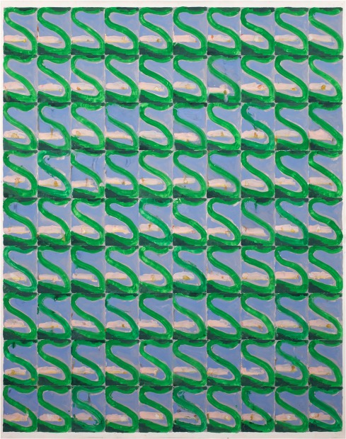
Flowering Apple Tree, ca. 1920-1933), 2013, gouache and pencil on paper,
195 x 153 cm
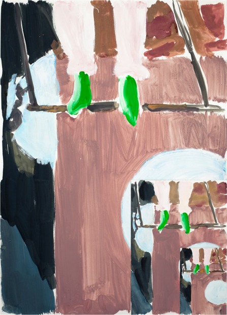
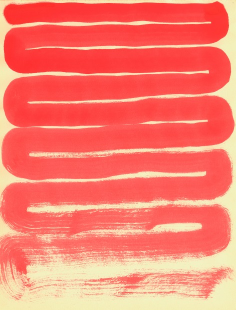
2012, gouache on paper, 97 x 70 cm (Private collection Belgium)
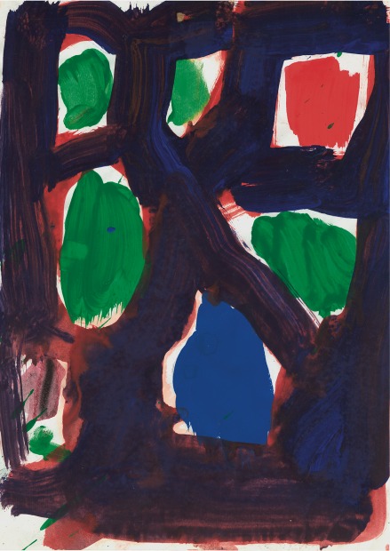
-vrijstaand2.jpg)
acrylic on paper, 152 x 115 cm (Collection Bonnefantenmuseum, Maastricht)
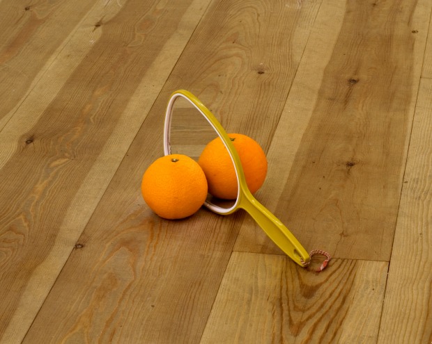
x 30 cm
 eyck
eyck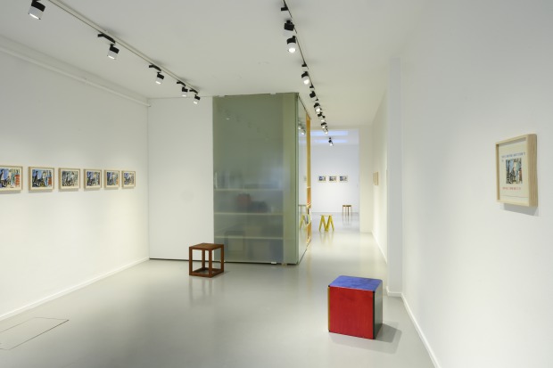
-zw-w-vr.jpg)
.jpg)

